The Living Room Edit: What I Look at Before I Change Anything
An interior architect on the decisions that make a living room feel right — and why most of them happen before you buy a single thing
HOW TO STYLE YOUR LIVING ROOM IN THIS GUIDE:The layout problem — why furniture against walls never works
The sofa — the most load-bearing decision in the room
The coffee table — its architectural role
Lighting — why one source is never enough
The floor — anchoring the arrangement
The finishing edit
The living room is the hardest room to get right. It has to do more than any other space in the house — hold a conversation, absorb an evening in front of a film, welcome guests, accommodate children, look considered at nine in the morning and still feel right at eleven at night. Most rooms struggle with one of these things. The living room has to manage all of them simultaneously.
What I find, almost without exception, is that living rooms that don't work have a layout problem. Not a furniture problem, not a colour problem, not a cushion problem. A layout problem. The furniture is arranged in a way that makes the room feel either empty or crowded, and no amount of styling resolves it. Fixing the layout — before spending anything, before changing anything — is almost always the first move.
1. The layout problem
Push all your furniture against the walls and the room will feel large and completely dead. It's the most common living room arrangement I see, and it creates a peculiar kind of emptiness: a huge open floor in the middle of the room that nobody crosses, and a ring of seating around the perimeter that discourages conversation and makes the room feel like a waiting area.
The fix is to float the furniture. Move the sofa away from the wall — even 30 to 40cm is enough to change the feeling of the room entirely. What happens is the seating group becomes its own spatial zone, a room within a room, rather than a perimeter. The space behind the sofa (between sofa back and wall) can hold a console table, a lamp, a plant. It doesn't need to be wide. It just needs to exist.
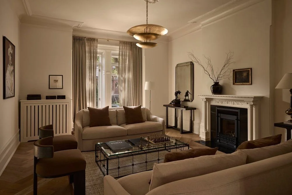
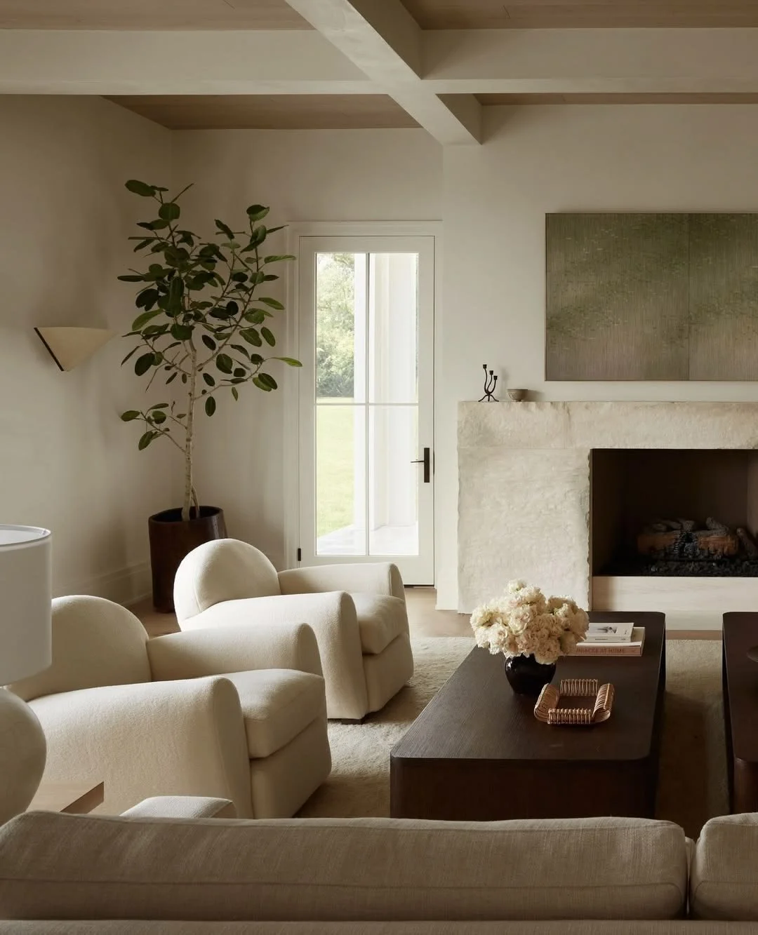
The second layout principle: all the main seating pieces should be able to converse with each other. That means no seat should be more than roughly 3 metres from another — beyond that distance, people raise their voices or stop talking. A horseshoe or U-shape arrangement, where two sofas or a sofa and two chairs face each other around a central table, is the most socially generous configuration. It works for two people as well as for eight.
One sofa pointing at a television is a cinema, not a living room. There's nothing wrong with that if it's what you want — but it's worth making the choice consciously.
2. The sofa
The sofa is the load-bearing decision. Everything else — rugs, lighting, tables, art — responds to it. Get the sofa wrong in scale or placement, and no amount of accessorising fixes it.
Scale: The sofa should be in proportion to the room. As a guide, the sofa should be roughly two-thirds the length of the wall it faces, or the wall it sits in front of. A sofa that is too small for the room reads as provisional, like it's a temporary arrangement. A sofa too large crowds the space and leaves no room for the other pieces the room needs.
Depth matters as much as length. A deep sofa (90cm+ seat depth) reads as relaxed and inviting but can overwhelm a smaller room and make the floor plan feel consumed. A shallower sofa (80–85cm) is more architectural, holds its shape better visually, and works in a wider range of room sizes.
Placement: The sofa should face something worth facing — a fireplace, a window with a view, a piece of art or an interesting wall. If the only thing it faces is a television on a white wall, that relationship will dominate the room regardless of everything else you do. Even a console beneath the television, properly styled, changes that dynamic significantly.
Colour: A neutral sofa — linen, boucle, a warm grey — is not a compromise. It's a considered foundation. The sofa is the largest upholstered surface in the room; if it's doing something dramatic with colour, every other decision becomes harder. A neutral sofa allows the room to develop around it over time. It can absorb colour through cushions and throws, and those can change.
3. The coffee table
The coffee table is more architecturally significant than it looks. It defines the centre of the seating group. It gives the space a visual anchor. And its height, relative to the sofa seat height, determines whether the room feels comfortable or awkward.
The rule is simple: the coffee table surface should sit at roughly the same height as the sofa cushions, or very slightly below — typically 40–45cm from the floor. A table that is too low requires leaning down to reach it and looks like it belongs to a different arrangement. A table that is too high reads as a dining table that ended up in the wrong room.
Scale matters here too. The table should be roughly two-thirds the length of the sofa. A table that is too small for the sofa leaves the ends of the seating group unanchored. Two smaller tables side by side, or an ottoman paired with a smaller tray table, can work well — they introduce visual variety and are more practical for a room that's actually used.
What sits on the coffee table is a separate question, but a useful one. A tray organises the surface and makes a group of objects read as deliberate. Books with interesting covers add height and texture. One object of sculptural interest — a stone, a ceramic, a small vessel — gives the eye somewhere to land. The table should look like someone edited it, not cleared it.
4. Lighting — why one source is never enough
The ceiling pendant or downlight that most living rooms rely on as their only light source does one thing: it illuminates. It doesn't create atmosphere, it doesn't flatter, and at night it makes a room feel like an office.
A living room needs at least three light sources, ideally at different heights:
Ambient light — a central pendant or ceiling fitting that handles general illumination. This should ideally be on a dimmer, because the level of light needed at midday is completely different from what works at nine in the evening.
Floor lamps — one on each side of the sofa, or in corners of the room, positioned at a height where the light source is at roughly seated eye level. This is the layer that makes a room feel warm rather than bright. A floor lamp with a fabric shade throws light upward and outward, washing the walls softly in a way no ceiling light achieves.
Table or accent lamps — on side tables, a console, a bookshelf. These create pools of light at lower levels and give the room visual rhythm. They also mean that at night, you can turn off the ceiling light entirely and use only the lamps — and the room will feel completely different.
If there's one intervention that costs relatively little and changes a living room dramatically, it's adding a floor lamp to a dark corner. The effect on the room's atmosphere is disproportionate to the effort.
5. The floor
The rug anchors the seating group and tells the floor where the conversation zone lives. Without it, the furniture looks like it arrived separately and stayed that way.
For sizing: at minimum, all front legs of all seating pieces should sit on the rug. Ideally, all four legs of each piece. A rug that only the coffee table sits on is not doing its job — it's covering a small patch of floor rather than defining a space. In most living rooms, this means a rug of at least 200x300cm, and often larger.
For placement: the rug should be centred within the seating group, not pushed toward one wall. The sofa and any chairs or armchairs should feel like they're sitting within the rug's zone, not orbiting it from the outside.
For a full guide to rug materials, pile height, pattern, and layering, see How to Choose a Rug.
6. The finishing edit
Once the layout is right and the key pieces are placed, the finishing work is about subtraction as much as addition. A living room that has been carefully arranged can still fail because it's carrying too much — too many surfaces cluttered with objects, too many cushions asserting themselves, too much happening for the eye to settle.
Walk through the room and take out anything that isn't earning its place. Not decorating isn't a failure of taste. It's a decision. Empty space in a well-proportioned room reads as calm and considered.
What should stay: things that have meaning, things that have genuine visual interest, things that are doing something for the room's texture or warmth. A good book left open on the coffee table. A plant that is genuinely healthy and appropriately sized for its spot. One piece of art hung correctly. A throw draped with intention, not habit.
What should go: the decorative objects bought to fill surfaces rather than because they were right, the candles that have never been lit, the cushions that match nothing, the things that arrived and stayed because nobody moved them.
Edit before you add. The room will tell you what it needs once it can breathe.