How to Style a Beautiful Bed
A guide to building a bed that looks considered, feels genuinely comfortable, and holds together — however you slept in it
HOW TO STYLE A BEAUTIFUL BED IN THIS GUIDE: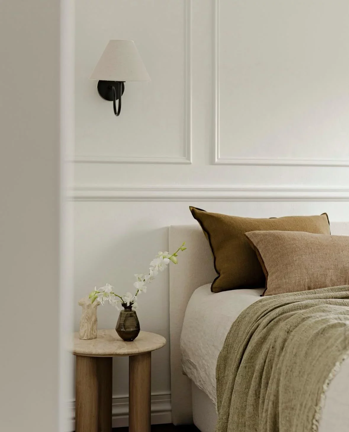
The bed is the largest flat surface in the bedroom. Its colour, texture and weight speak louder than anything else in the room — louder than the curtains, the rug, the art on the wall. Which means it's also the thing that, when it isn't quite right, makes everything else feel slightly off.
Most beds I see are either under-dressed — a thin duvet, two flat pillows, nothing that gives the eye anywhere to land — or over-dressed: layer upon layer, cushion upon cushion, an arrangement so elaborate that the room looks like it belongs in a catalogue and feels like nowhere anyone actually sleeps. What both have in common is that they haven't been approached with intention.
This is how I approach it.
1. The centre of gravity
Before any decisions about linen or layering, it's worth thinking about what the bed needs to do for the room as a whole.
If the room is already carrying pattern — in the wallpaper, the curtains, a bold rug — the bed should be quiet. Neutral, textural, restrained. It anchors the room rather than competing with it. If the room is plain — white walls, simple flooring, little decoration — the bed can do more. A deeper colour, a more complex arrangement, something that gives the room its character.
The bed and the room are in conversation. The mistake is styling the bed in isolation, without asking what the room needs from it.
2. Materials — what they actually look like, not just how they feel
Most guidance on bedding materials focuses on comfort and durability. Both matter. But from a design perspective, what matters equally is how the material behaves visually — how it drapes, how it reads at a distance, what it looks like in natural light at different times of day.
Linen is the most considered choice for any layer that will be seen. It drapes naturally rather than rigidly, improves in texture with every wash, and photographs beautifully. A linen duvet cover that isn't perfectly pressed is still doing something right — the slight irregular surface is part of what makes it look alive rather than inert. It's also the most forgiving choice in a room where not everything can be controlled. Linen looks intentional even slightly undone.
Cotton percale has a crispness that reads as precise and clean — good for a room that leans architectural and controlled. It shows wrinkles more readily than linen, which means it either needs to be well made or it reads as neglected. The tradeoff for that sharpness is that it requires more maintenance to hold the look.
Sateen — a smooth, slightly lustrous weave — catches light differently from the others. It has a softness that reads as warm, almost hotel-like. In a darker room or a room with low winter light, it adds a gentle luminosity that flatter, matte fabrics don't.
For the layers that will be seen — the duvet cover, the top sheet, the shams — choose materials that behave well visually. For the layers that won't — the fitted sheet, the mattress protector — prioritise comfort and quality above all.
Whitton Cushion
The White Company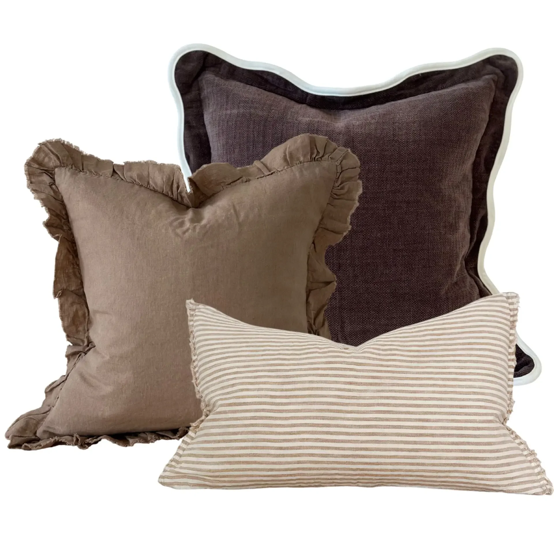
The Light Brown Stripe Combination
Ellenvale InteriorsFavourites cushions
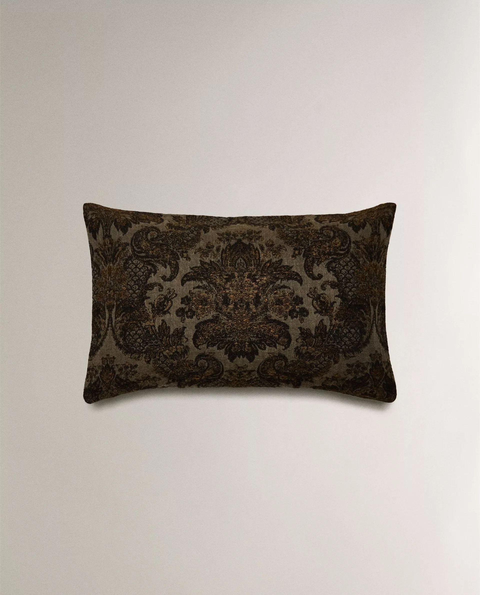
Jacquard cushion cover
ZARA Home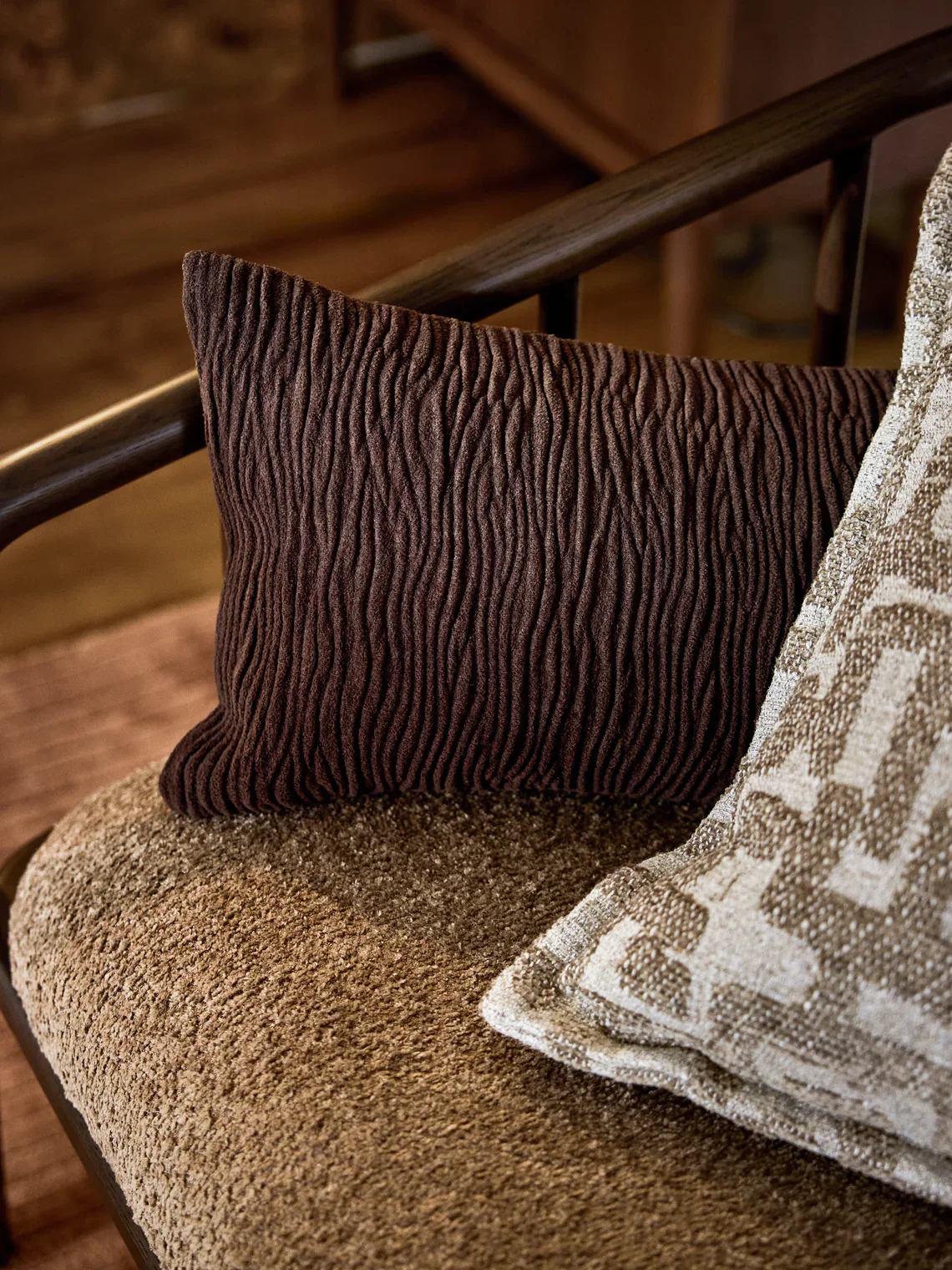
Pleated Cushion Cover Lorenzo
Westwing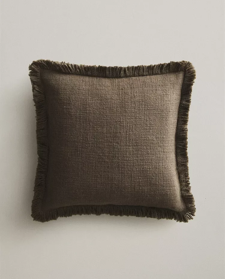
Cushion Cover with Fringing
ZARA Home3. Building the layers
A well-made bed has structure. It's built, not just assembled. The order matters.
The foundation: Start with a well-fitted bottom sheet — one that pulls taut across the mattress without gathering or wrinkling. A sheet that fits correctly makes everything above it sit better. This is worth spending on. Not because thread count is the whole story, but because a good fitted sheet holds its shape wash after wash, and the structure of the bed starts here.
The main layer: A duvet or a quilt — or both. McGee's approach of a duvet as the primary layer with a quilt folded at the foot is a sound one: the duvet provides volume and warmth; the quilt adds texture, visual interest, and flexibility for different temperatures. If using just one, choose a duvet with genuine loft. A flat duvet doesn't matter how good the cover is — the arrangement reads as deflated.
The cover relationship: Where possible, mix the materials of the cover and the underlying layers. A linen duvet cover over cotton bedding. A cotton quilt over linen sheets. The contrast between materials — the slight difference in how light falls on each surface — is what gives a bed its depth. A bed where everything matches exactly tends to look more clinical than considered.
4. The pillow arrangement
This is where most beds go either too sparse or too fussy, and where a few clear rules make the decision easier.
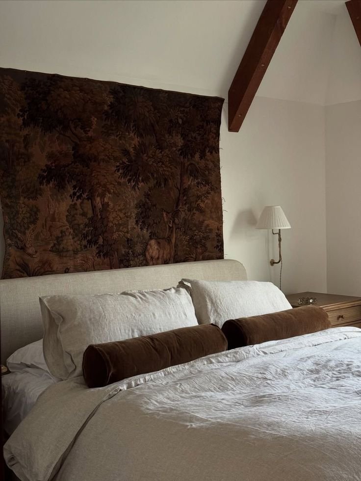
The logic is architectural: you're building a composition that has a back layer, a middle layer, and a front statement. Each layer should relate to the one behind it — stepping down in size, changing in texture or colour, creating a rhythm from the headboard to the duvet.
The back row: Two sleeping pillows in cases that coordinate with the duvet cover. These are the structure. They should be full — a flat sleeping pillow makes the whole arrangement look tired. European square pillows (65x65cm) used as shams behind sleeping pillows add height and presence, particularly behind a low or modest headboard.
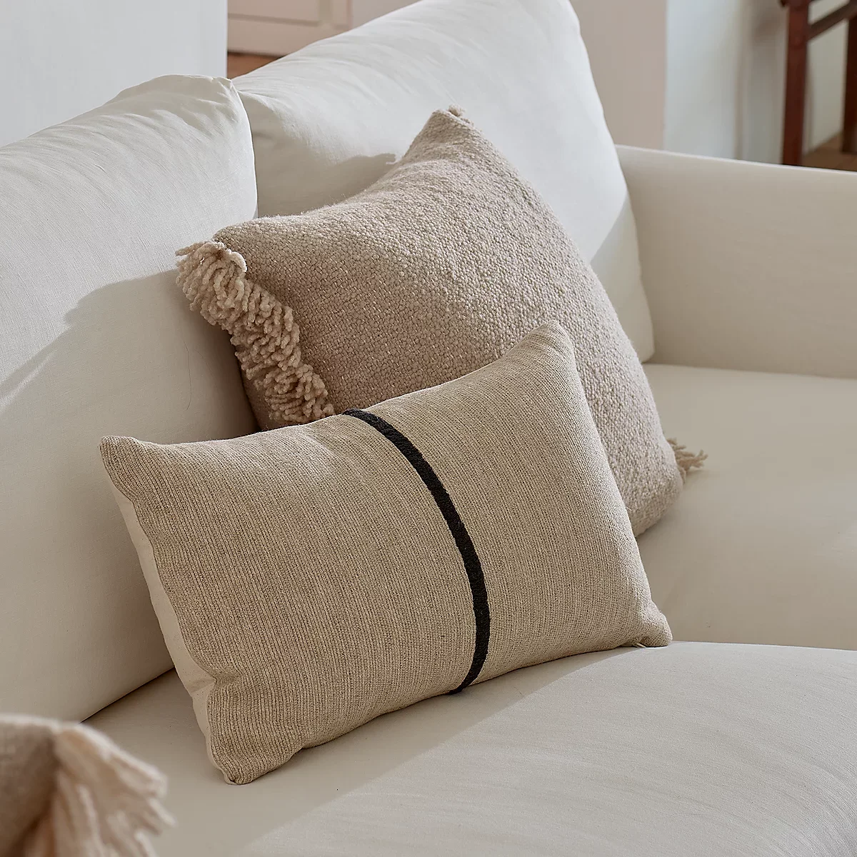
The middle layer: One or two standard cushions that introduce a texture or tonal shift. This is where a linen cushion against a cotton duvet, or a slightly deeper tone against a neutral base, does its work. They sit in front of the sleeping pillows but aren't the main event.
The front statement: One element that ends the arrangement — a long lumbar cushion across the full width of the bed, or a single square cushion in a material that reads differently from the rest. The lumbar in particular is an underused choice: it has a clarity and proportion that a pile of round or scattered cushions doesn't. It's architectural. It finishes the arrangement rather than adding to it.
Symmetry reads as formal; a slight imbalance reads as considered. If the front of the bed feels too neat — perfectly matched cushions on each side, everything mirrored — take one thing away. What's left will almost always look more alive than what you started with.
5. The finishing layer
The last layer is the one that tells you the bed is finished. Not in a decorative sense — in a compositional one. Something at the foot of the bed closes the arrangement the way a full stop closes a sentence.
What that element is matters less than the fact that it exists and that it's in dialogue with what's above it. A blanket in a contrasting weave. A quilt in a tone that deepens the palette slightly. The key word is contrast — in texture if not in colour. If the bedding is already linen, a throw in wool or cashmere adds a different weight and surface. If the bedding is smooth sateen or cotton, something with visible texture — a waffle weave, a chunky knit — gives the eye a place to land.
How it sits is a decision too. Folded cleanly and placed with precision reads as composed. Draped slightly to one side reads as lived-in. Both are valid. The choice belongs to the room.
6. Knowing when to stop
This is, in the end, the hardest part. There's a point at which the bed is right — layered enough to feel rich, edited enough to feel intentional — and adding one more cushion tips it from composed to accumulated.
The European approach is a useful reference: fewer decorative cushions, better quality base layers, more emphasis on the material and less on the arrangement. A bed with beautiful linen, one or two well-chosen cushions, and a considered throw has more presence than a bed with six decorative cushions and average bedding. The restraint is the point.
What you're aiming for is a bed that looks like someone made it, not like someone styled it. Those are different things. One feels like home; the other feels like a set.