How to Hang Art: The Proportion Rules That Actually Matter
An interior architect on the decisions most people make by instinct — and why that usually goes wrong
Art decisions tend to be made emotionally. You find a piece you love, you bring it home, you hold it against the wall in roughly the right place, and you put a nail in. The result is a room full of things you chose carefully, hung carelessly — and a nagging sense that the walls never quite look the way you intended.
The issue isn't the art. It's the proportion. Hang the same piece at the wrong height and it floats, disconnected, neither part of the room nor commanding enough to stand alone. Hang it correctly and it anchors the space. The work hasn't changed. The placement has.
These are the rules I use, and why they work.
1. The mistake almost everyone makes
They hang it too high.
This is so consistent it has become one of my most reliable observations: walk into almost any home, look at the art on the walls, and the centre of the piece will be significantly above eye level. Sometimes dramatically so. Art that should be in conversation with the room ends up hovering above it, requiring you to look up as if you're reading a sign rather than looking at something.
The reason this happens is intuitive but wrong: people hang art where there's wall space, and wall space tends to feel more abundant higher up, away from furniture and light switches and doors. The impulse is to give the piece room. What it actually needs is to be in the room — at the height where human eyes naturally land.
Fix this before anything else. If your art feels like it belongs to the ceiling more than the floor, lower it.
2. Hanging on a blank wall
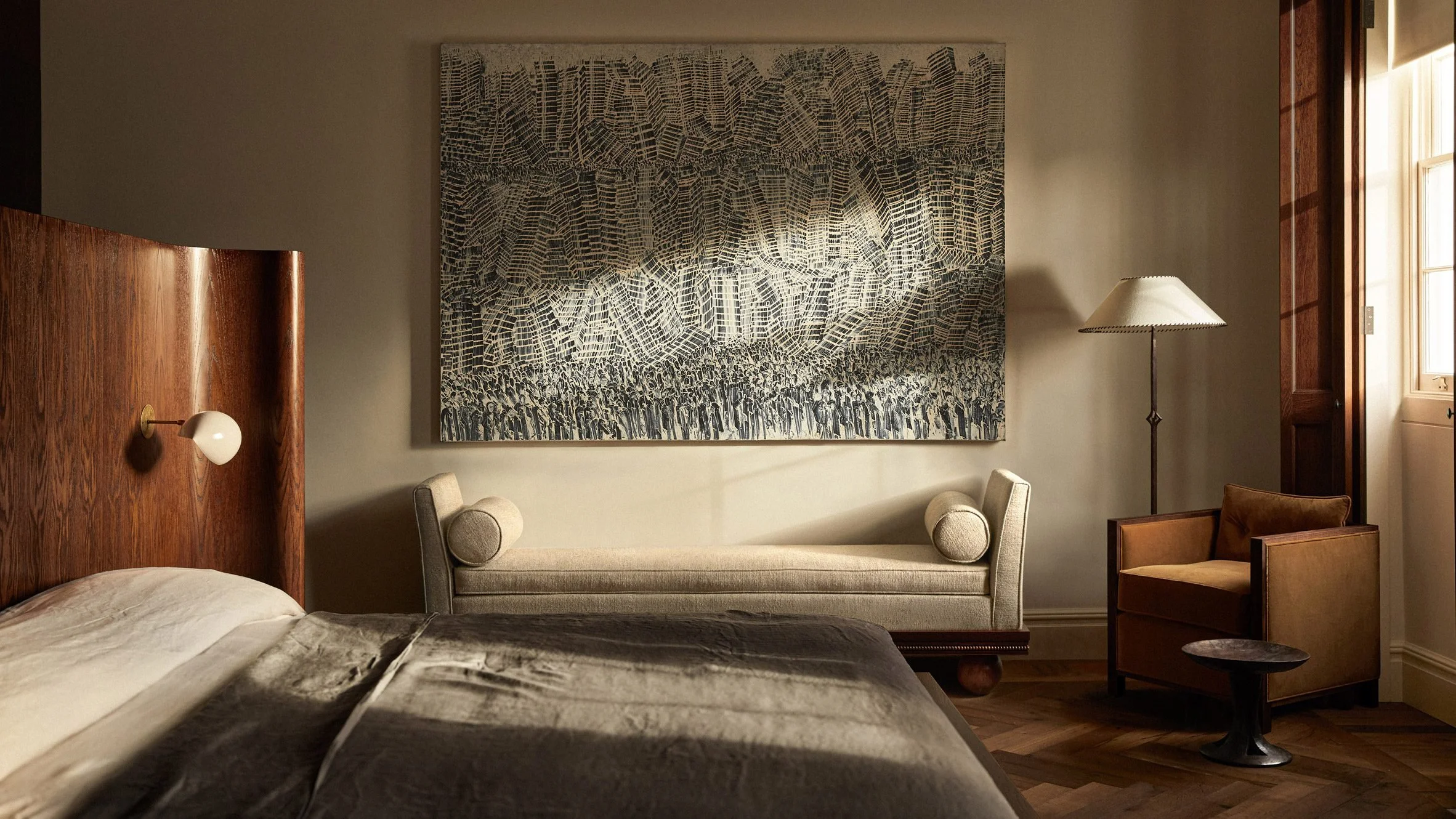
The standard used in galleries and museums — and the most reliable starting point for any room — is to position the centre of the piece at approximately 145cm (57 inches) from the floor. This corresponds to average standing eye level and creates a natural focal point that reads as balanced and settled.
In rooms with particularly high ceilings, you can adjust to around 152cm (60 inches), but resist the urge to go higher than that simply because there's more wall above. The height of the ceiling doesn't change where human eyes naturally fall.
Scale is as important as height. A single piece on a large wall needs to be larger than feels comfortable to choose. Most people underestimate the scale required — they select a piece that looks impressive in a gallery or online, bring it home, and find it disappears against the wall. As a rough guide, the art should occupy at least half the width of the wall it's on, or it will read as incidental rather than intentional.
One exception: a very small piece, deliberately placed, with clear intention. A single postcard-sized drawing hung at exactly the right height, framed simply, on an otherwise empty wall can read as highly considered. The problem isn't small art — it's small art pretending to be the main event when it doesn't have the presence to carry that.
Breaking Ground
Green Lili
Abstract Horizon
Kare DesignAffordable Art
Canvas Print After Dark
Malerifabrikken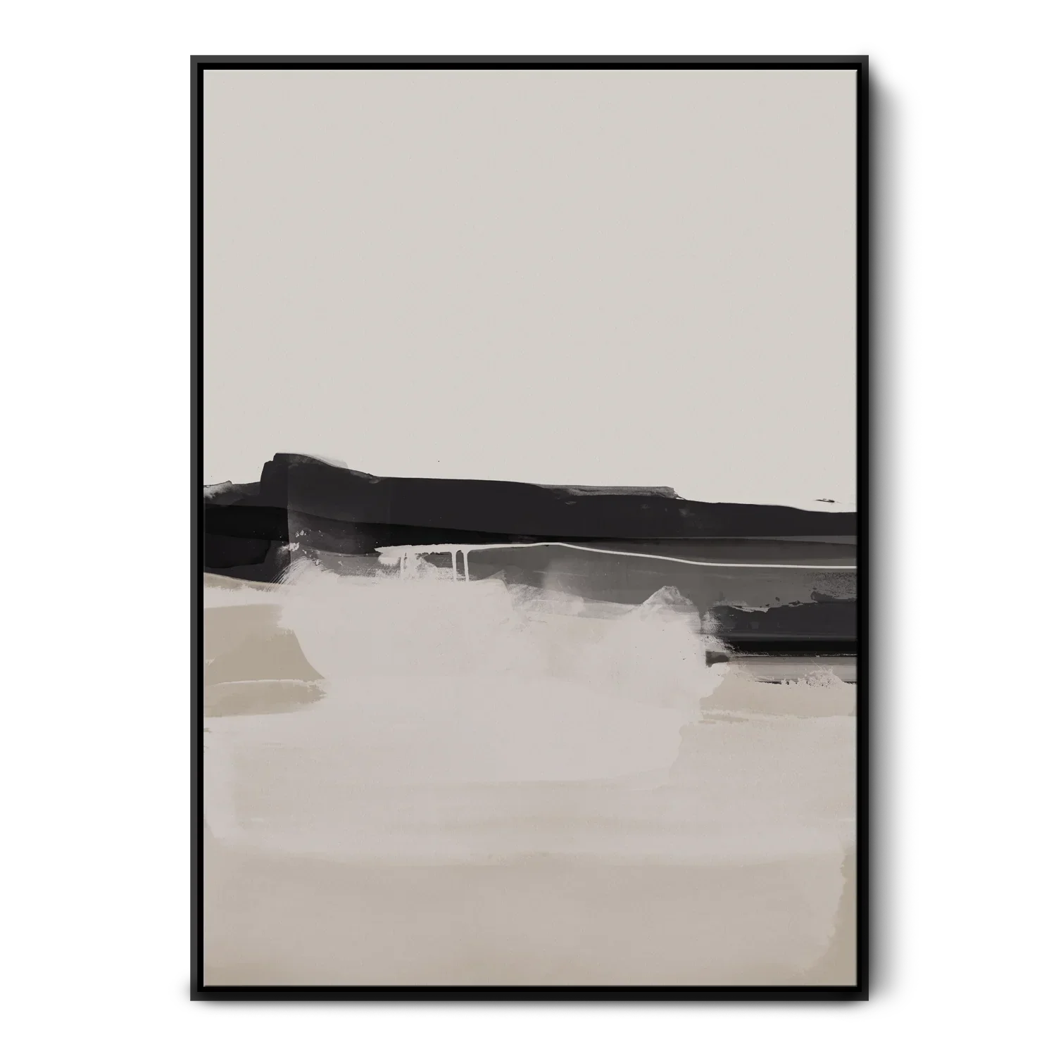
Soothe The Soul
Green Lili
Canvas Painting Green Petite
Malerifabrikken3. Hanging above furniture
When art sits above a piece of furniture — a sofa, a bed, a console, a dining sideboard — the relationship between the two is architectural. They need to feel like they belong to each other, not like one arrived after the other and happened to end up in the same room.
Two rules govern this:
Width. The art (or grouping) should span roughly two-thirds the width of the furniture below it. A piece that is too narrow will look orphaned above a wide sofa. One that's wider than the furniture will visually detach from it and start competing with the room. Two-thirds gives the eye a connected composition rather than two separate objects.
Gap. The bottom edge of the frame should sit approximately 15–20cm (6–8 inches) above the top of the furniture. Close enough that the two read as related; far enough that there's breathing room between them. Less than this and the art feels precarious; more and the connection breaks.
Above a bed specifically, this gap can be slightly more generous — up to 25cm — because bedding and pillows add visual height that a sofa doesn't. The art should sit above the arrangement, not behind it.
4. Hanging in groupings
Gallery walls succeed when they have an internal logic. They fail when they are a collection of things someone loves without a compositional principle holding them together.
Before choosing what to group, decide on the unifying element. It might be a consistent frame style — all black, all natural wood, all the same moulding profile. It might be subject matter: a collection of botanical prints, a series of architectural drawings, a set of family photographs. It might be palette — works that share a tonal range even if they're very different in style. What it cannot be is everything at once. Frame styles, sizes, mediums, subjects all varying equally produces visual noise, not a considered arrangement.
For placement: keep 5–7cm (2–3 inches) between frames — enough to read as separate pieces, close enough to read as one composition. Position the centre of the overall grouping at the same 145cm eye-level point you'd use for a single piece. And before a single nail goes in, lay everything on the floor and live with the arrangement. Move things. Step back. Photograph it. What feels balanced on the floor will feel balanced on the wall.
One practical technique that changes everything: cut paper templates of each frame and tape them to the wall with low-tack tape before committing. Adjust until it's right. Holes in the wrong place are permanent; tape is not.
5. You don't always have to hang it
This is the thing that most guides treat as a styling trick. I'd argue it's often simply the more architecturally considered choice.
A framed work leaning against a wall — on a console, a mantelpiece, a bookshelf, a low credenza — has a different quality than a hung piece. It reads as placed rather than installed. There's a sense that it could be moved, which paradoxically makes it feel more considered than something fixed. It's also more honest about the fact that collecting and living with art is an evolving process, not a single decision.
Leaning works particularly well for large-format pieces in rooms where the wall architecture doesn't naturally accommodate hanging — where skirting boards are deep, or the wall is broken up by door frames and architraves. A large canvas leaning on the floor against a wall becomes a feature of the room rather than a challenge to the architecture.
The rule is the same as for hanging: scale matters. A small piece leaned on a large console loses itself. A work that fills at least half the width of the surface below it commands the arrangement.
6. Lighting the work
This is the detail that changes everything and that almost no one thinks about until the room is finished.
Art changes completely depending on how it's lit. A piece that holds a wall beautifully in daylight can disappear entirely at night if the only light source is a ceiling pendant overhead. Overhead light creates shadows on textured surfaces; it flattens colour; it turns a considered piece into a dark rectangle on a wall.
A picture light — mounted directly to the frame or on the wall above the piece — illuminates the work from close range and at an angle, bringing out texture and depth in a way that ambient room lighting never will. Battery-operated picture lights have become very good, which means this no longer requires rewiring a wall.
If a picture light isn't possible, position a floor lamp or a table lamp so it throws light toward the piece from the side. Directional light — even imperfect — is better than overhead light for art almost without exception.
Art is architectural. It divides walls, creates rhythm, establishes scale, draws the eye through a room. When it's well placed, you don't notice the thought behind it. You just feel that the room is right.
That's the goal.